


The Psychology of Color in Marketing and Branding
Hey marketers and brand enthusiasts! Ever wondered why certain logos and advertisements just grab your attention? The secret lies in the psychology of color, a powerful tool that influences emotions, perceptions, and brand identity. Let's unravel the vibrant world of colors and how they shape our marketing experiences.
The Impact of Color on Emotions: Painting a Brand Story
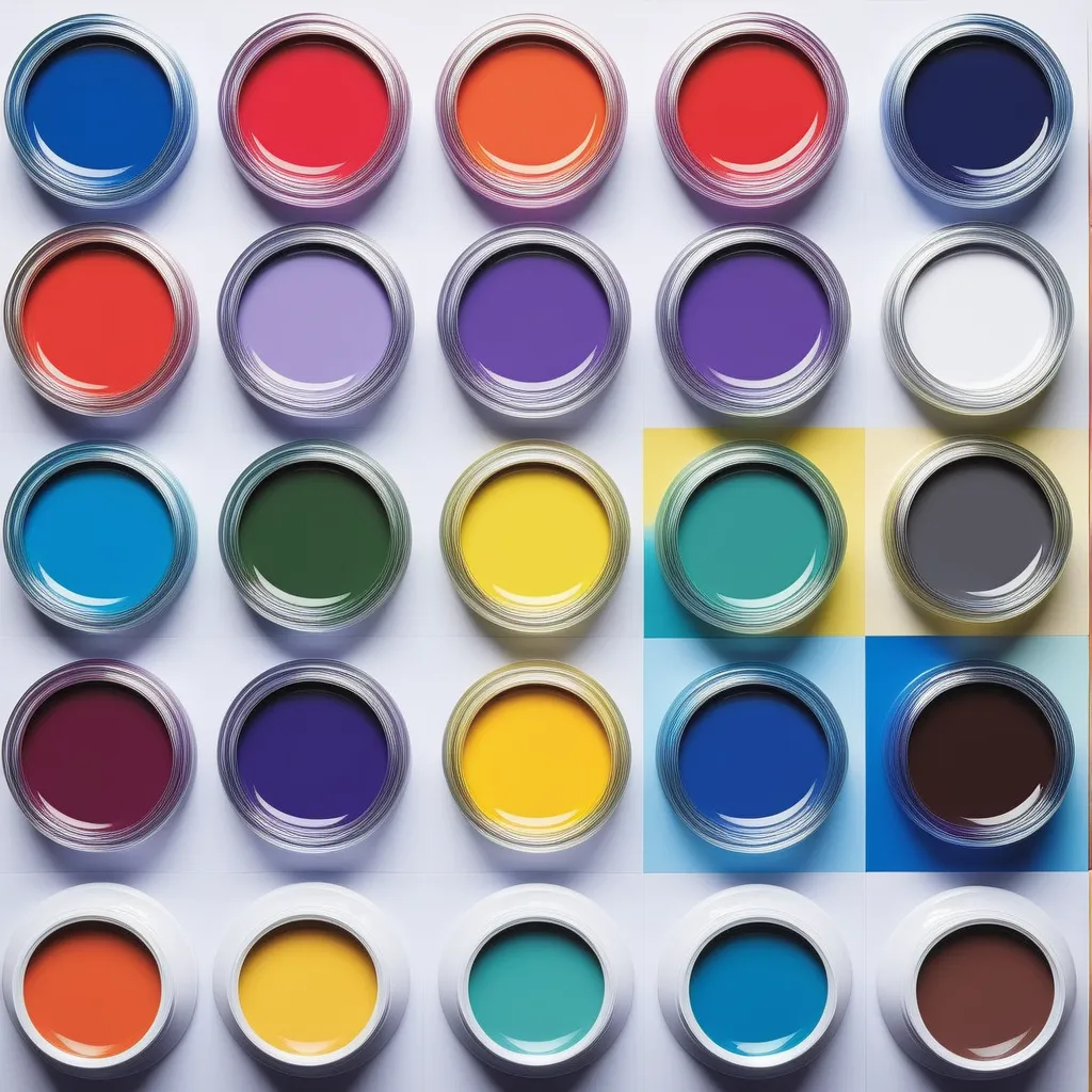
Colors are more than visual aesthetics; they evoke emotions. Alex, a marketing guru, explained how the right color palette can trigger specific feelings and associations. Warm tones like red and orange might convey energy and excitement, while blues and greens evoke calmness and trust.
Color Journey: Jenny's Online Shopping Experience
Jenny, an avid online shopper, noticed how her favorite fashion brands strategically used colors. A vibrant red banner announcing a sale made her feel a surge of excitement, while a serene blue backdrop reassured her during the checkout process.
Building Brand Identity: Colors as Brand Ambassadors
Your brand's color scheme becomes its visual identity. Mike, a branding expert, emphasized the importance of consistency. When consumers consistently see specific colors associated with a brand, it creates brand recognition and fosters trust.
Brand Recognition Triumph: Emily's Coffee Shop Connection
Emily, a coffee enthusiast, shared her strong connection with a local coffee shop. The warm brown and gold hues of the logo and interior became synonymous with her favorite brew. The colors didn't just represent the brand; they embodied the cozy coffee experience.
Color Associations: The Subconscious Language of Hues
Colors communicate subtle messages, often on a subconscious level. Tom, a graphic designer, pointed out how cultural and contextual factors influence color perceptions. For example, red may symbolize passion and love in one culture but signal danger in another.
Cultural Contrast: Sarah's International Marketing Lesson
Sarah, working on an international marketing campaign, learned the importance of cultural sensitivity. The cheerful yellow used for a promotion in one country had to be reevaluated when it was associated with mourning in another. Understanding color meanings is key to effective global marketing.
Call-to-Action Colors: Urgency and Conversions
Certain colors prompt immediate action. Alex revealed that red is often used for urgency and impulse buying, while green suggests relaxation and is associated with eco-friendly and sustainable products. These color choices can significantly impact conversion rates.
Conversion Chronicles: Jenny's Flash Sale Frenzy
Jenny recalled a flash sale email that used bold red fonts and countdown timers. The urgency conveyed by the red elements pushed her to make a quick purchase decision, showcasing how color played a role in the success of the promotion.
Contrast and Readability: Ensuring Visual Harmony
Color contrast is crucial for readability and accessibility. Mike stressed that poor color choices can lead to eye strain and difficulty reading. High contrast, like black text on a white background, enhances legibility and ensures your message gets across.
Readability Revelation: Emily's Website Redesign
Emily, revamping her blog, faced challenges with color contrast. Experimenting with different color combinations, she found that a dark blue font on a light background significantly improved readability, making her content more accessible to readers.
Adapting to Trends: Staying Fresh and Relevant
Colors, like fashion, follow trends. Tom highlighted the importance of staying current to resonate with target audiences. Refreshing your brand's color palette can signify innovation and modernity.
Trendy Transformation: Sarah's Social Media Rebranding
Sarah, managing a brand's social media presence, navigated a rebranding journey. Shifting from muted tones to a vibrant, trendy color scheme revitalized the brand's image, attracting a younger demographic and increasing engagement.
Conclusion: Painting Success with the Right Palette
In conclusion, the psychology of color is a powerful tool in the marketing and branding toolbox. Whether you're aiming for emotional connection, brand recognition, or driving conversions, choosing the right colors is like painting a canvas of success. So, marketers, mix your colors wisely, and let your brand's vibrant personality shine through!